Cœur en deuil
Cœur en deuil
Cœur en deuil
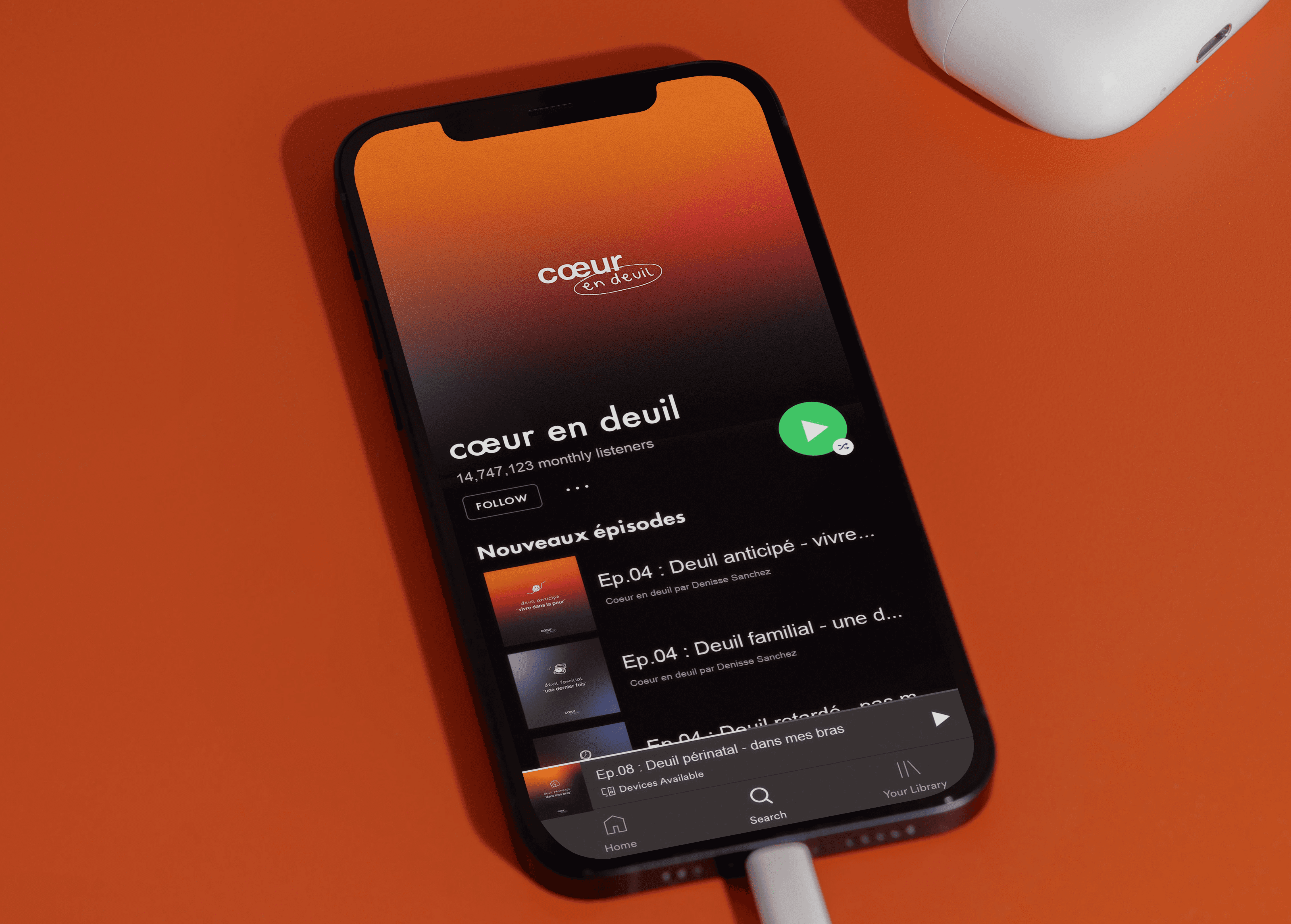
To break the taboo around grief and help people heal, I created Cœur en Deuil (Heart in Mourning in french), a podcast that explores the emotions associated with loss and the paths toward healing.
Type
Master's Final project
Services
Visual Identity
UI & UX Design
Visual Identity
UI & UX Design
Industry
Health
Date
June 2024
To break the taboo around grief and help people heal, I created Cœur en Deuil (Heart in Mourning in french), a podcast that explores the emotions associated with loss and the paths toward healing.
Type
Master's Final project
Services
Visual Identity
UI & UX Design
Industry
Health
Date
June 2024

Context
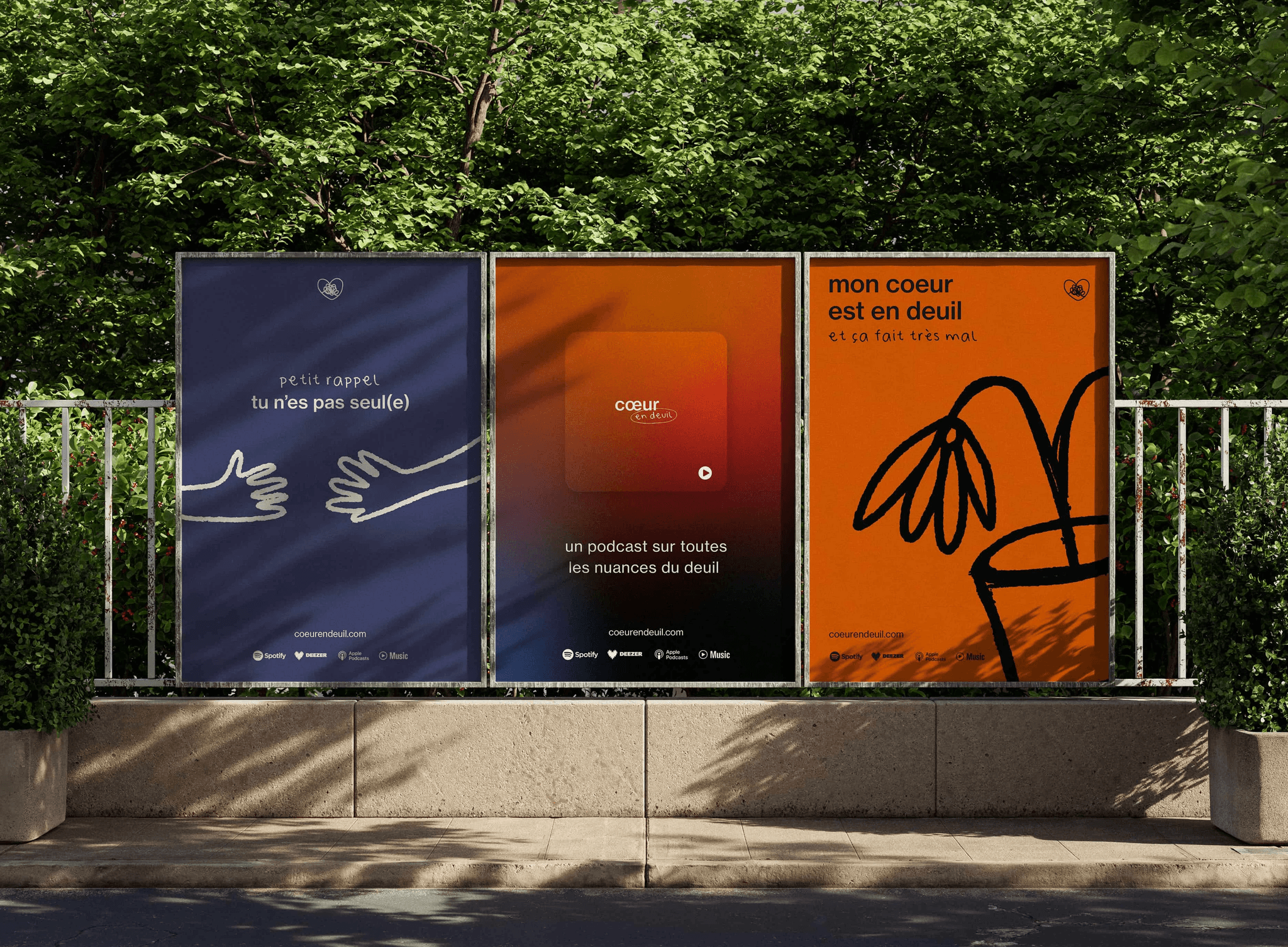
Grief is a part of life, and it not only pertains to the loss of a loved one. It can also affect those who move far from home or go through a breakup. To break the taboo surrounding grief and help people heal, I created "Heart in Grief", a podcast that explores the emotions related to loss and the paths to healing.
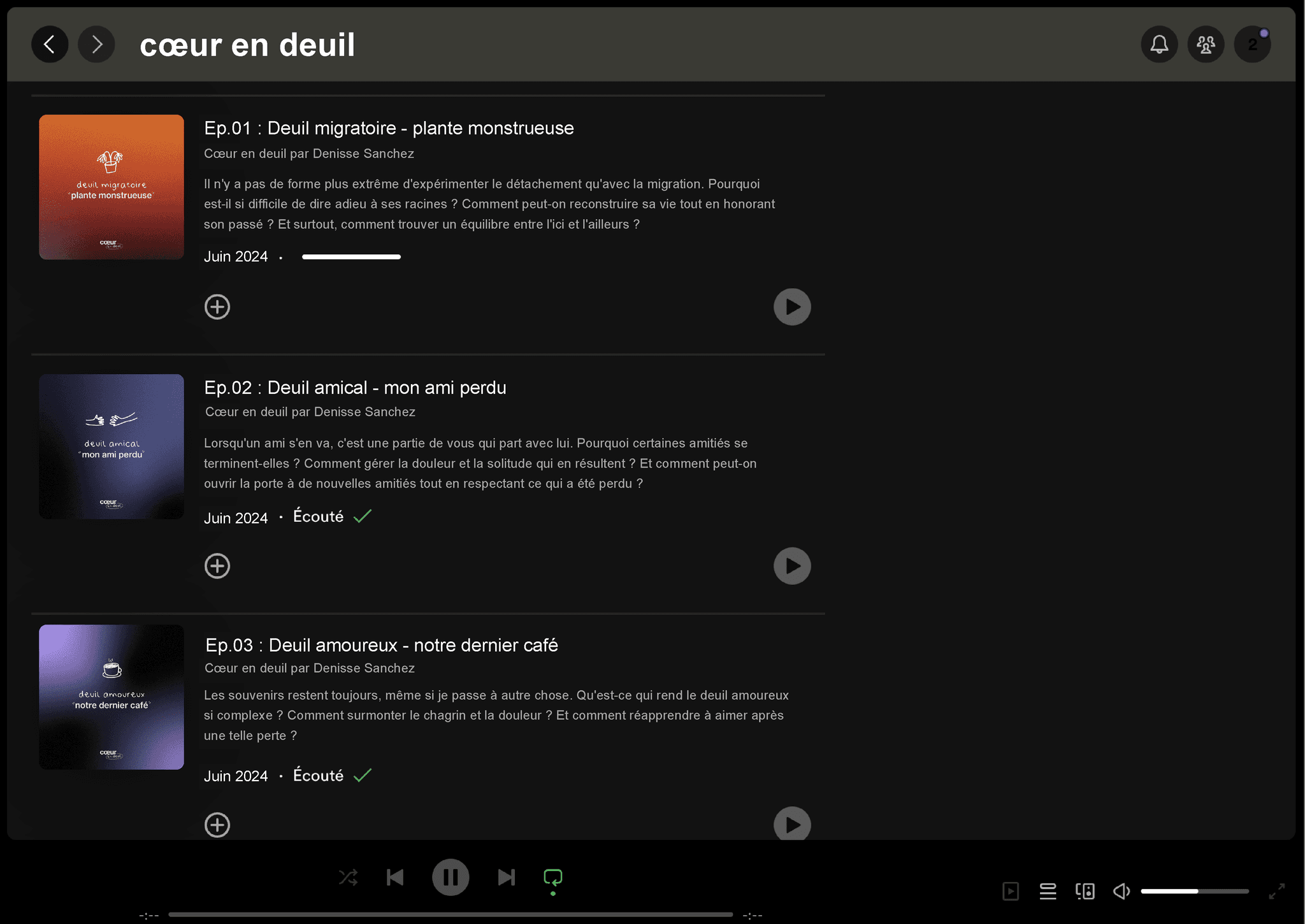
In each episode, guests share their stories, recount how they have overcome grief, and provide practical advice to help others. The podcast "Heart in Mourning" is a safe and welcoming space where everyone can talk about their experiences, find support, and discover resources to get through difficult times.
Context
Grief is a part of life, and it not only pertains to the loss of a loved one. It can also affect those who move far from home or go through a breakup. To break the taboo surrounding grief and help people heal, I created "Heart in Grief", a podcast that explores the emotions related to loss and the paths to healing.
In each episode, guests share their stories, recount how they have overcome grief, and provide practical advice to help others. The podcast "Heart in Mourning" is a safe and welcoming space where everyone can talk about their experiences, find support, and discover resources to get through difficult times.
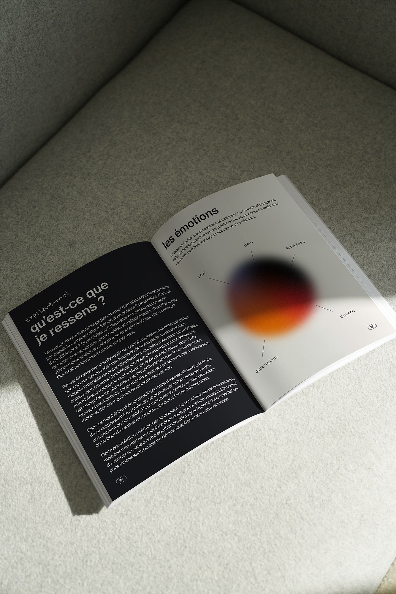
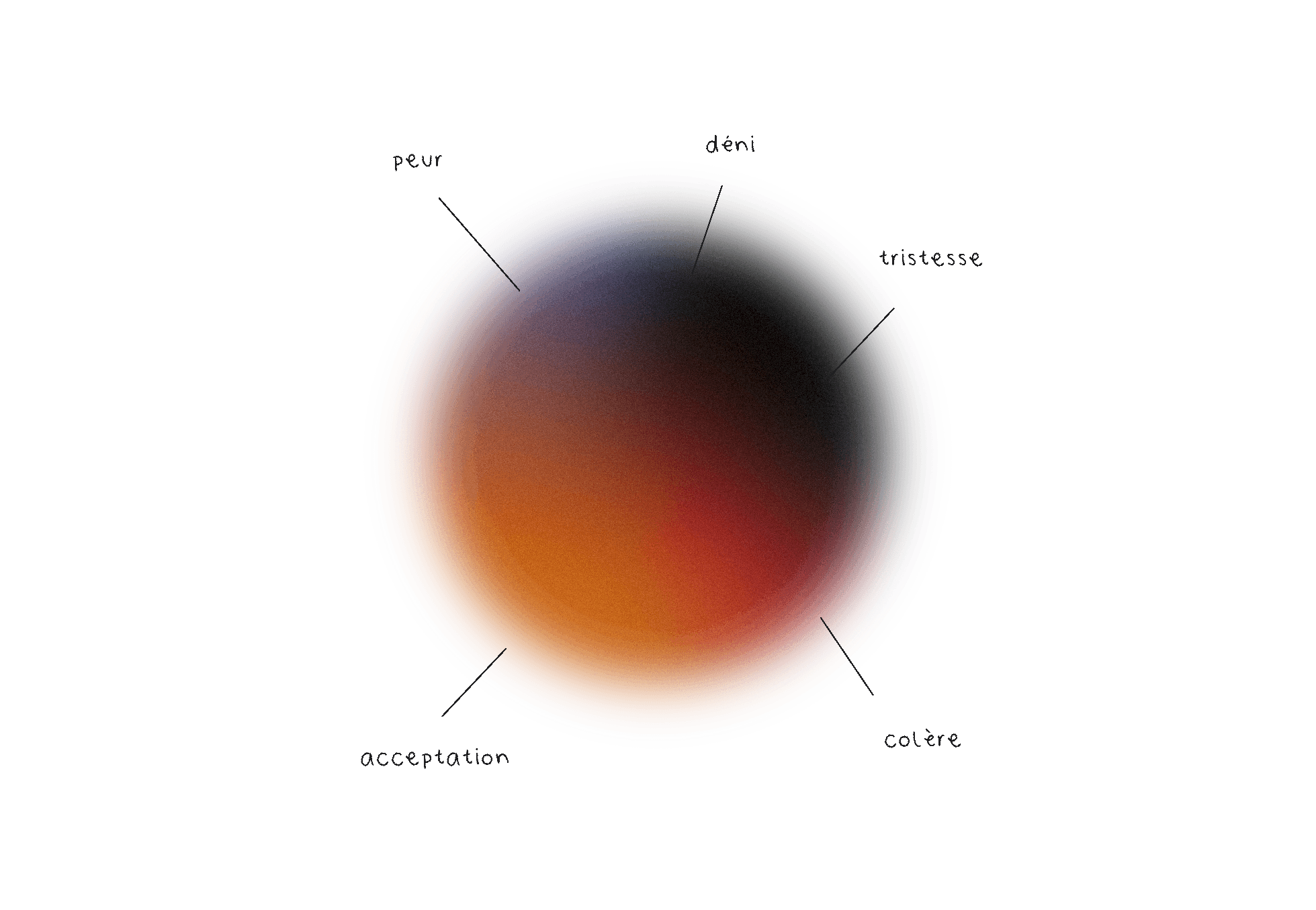
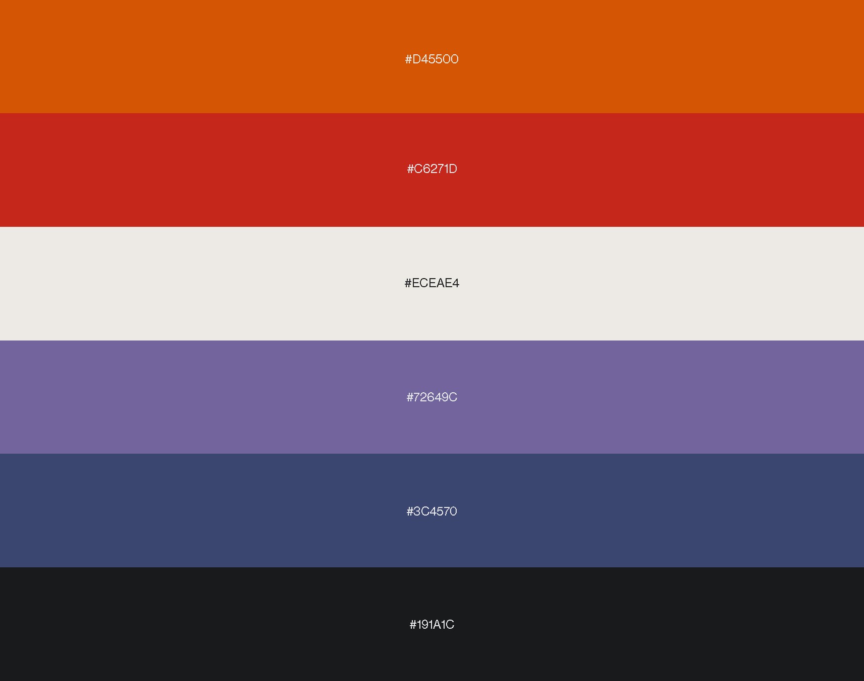
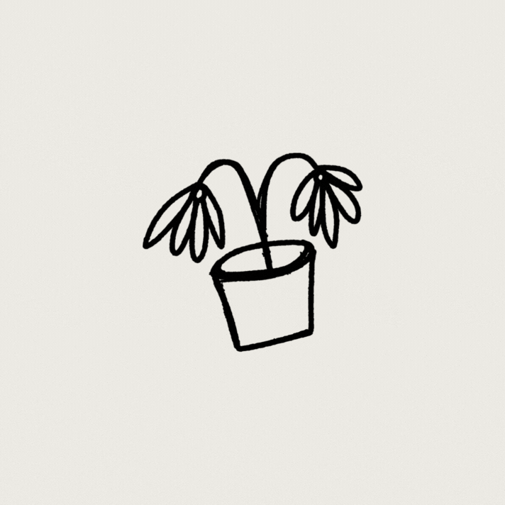
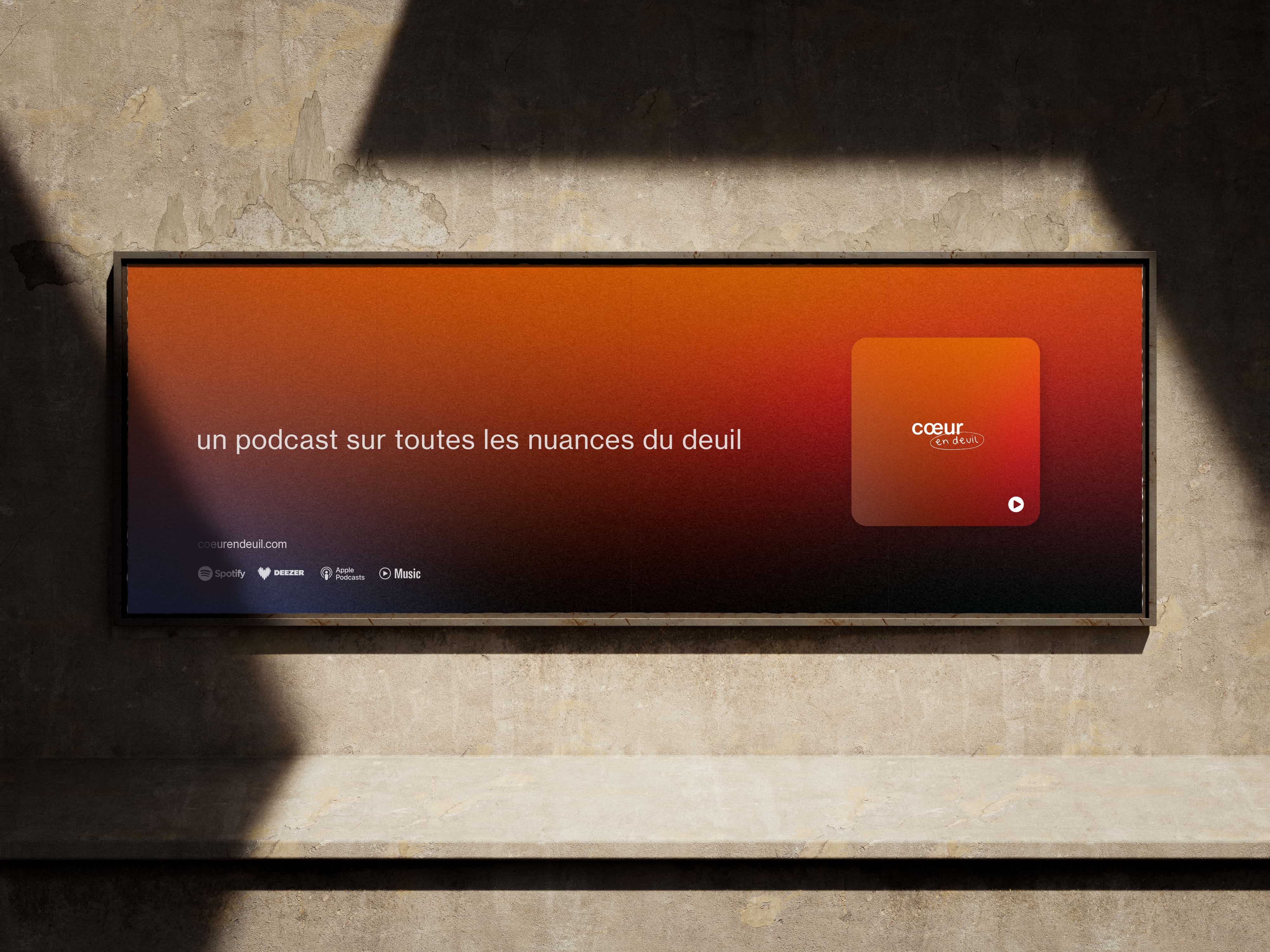
Colors
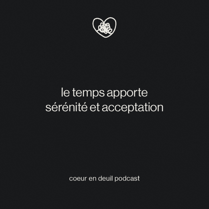
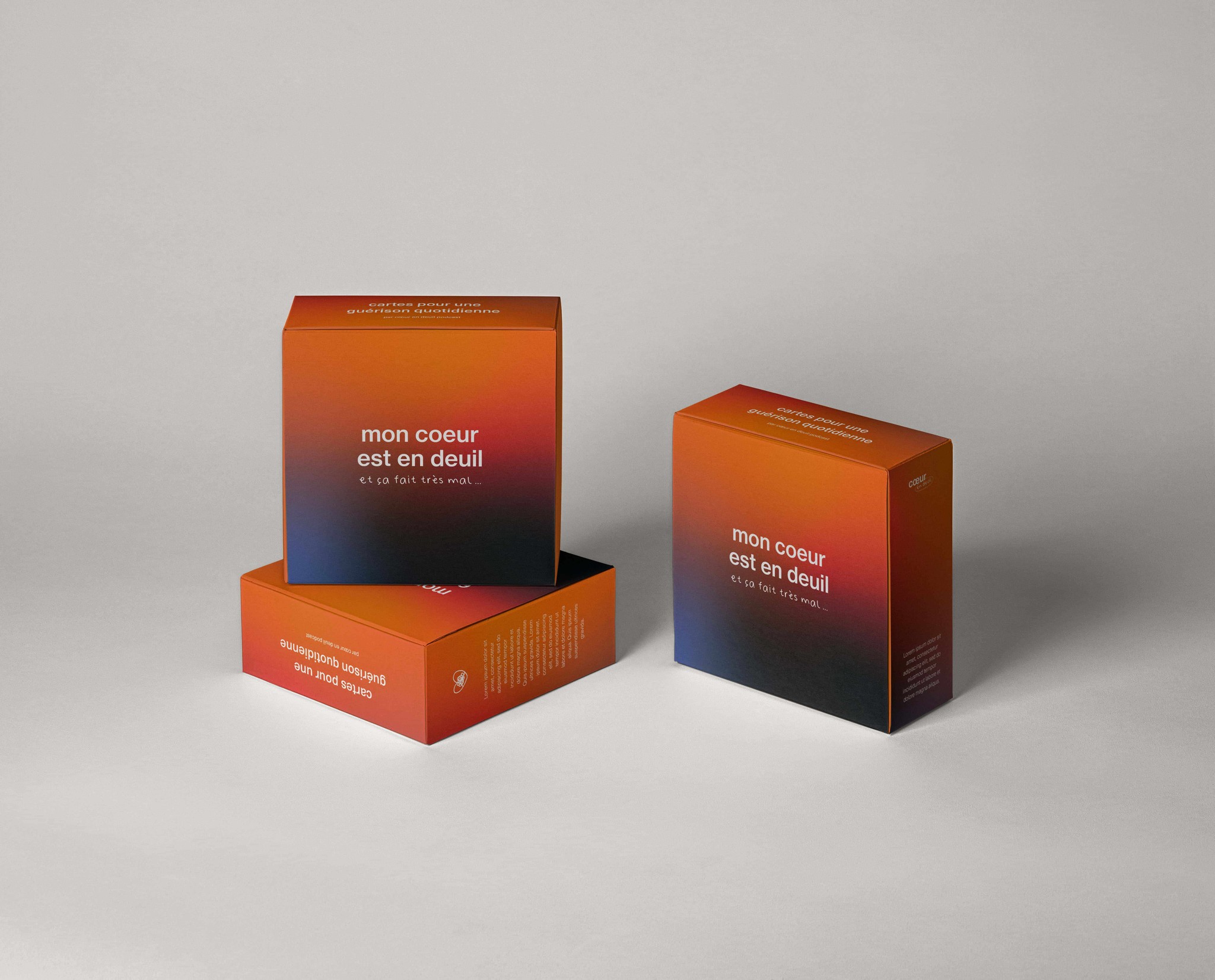
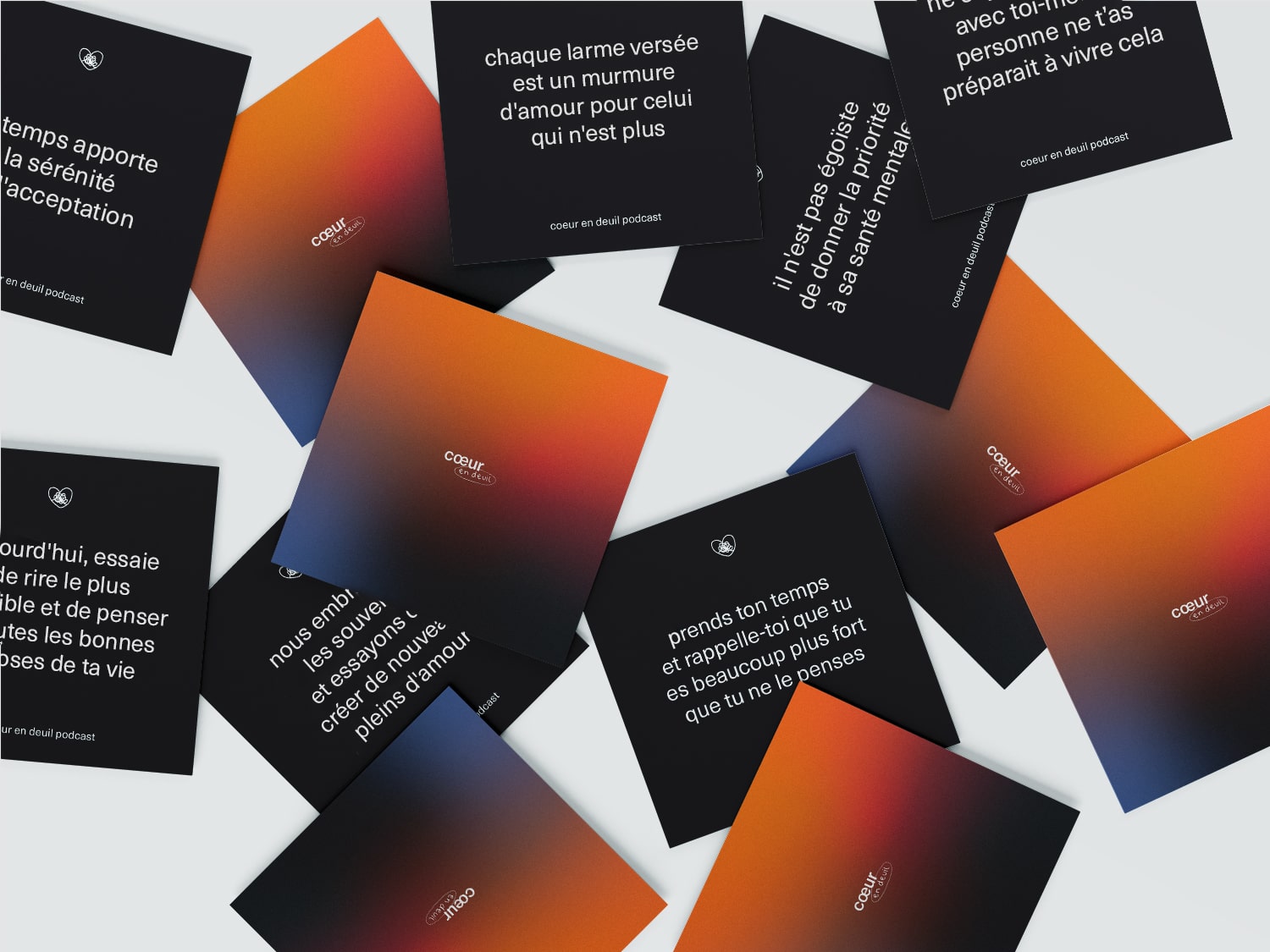
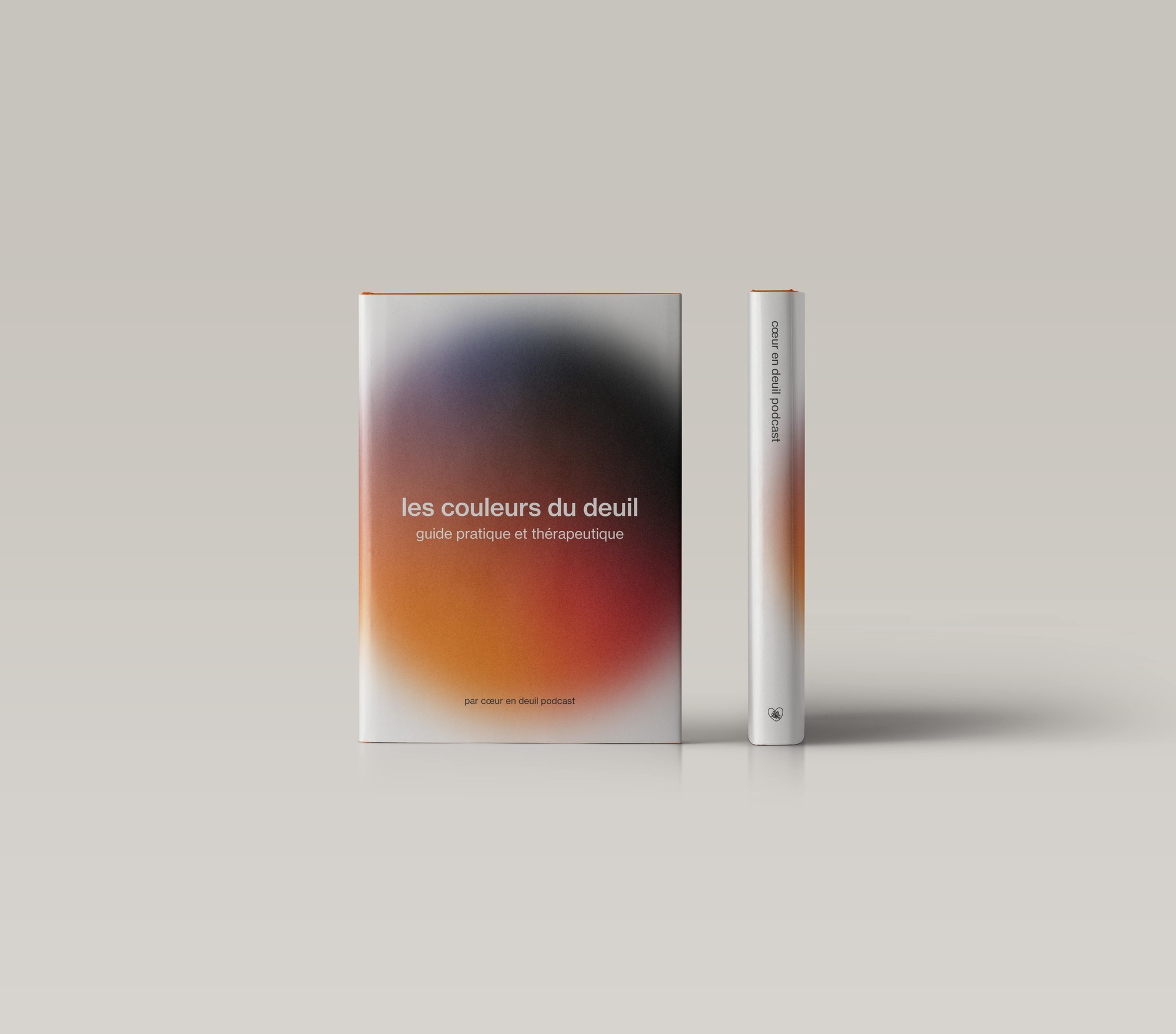
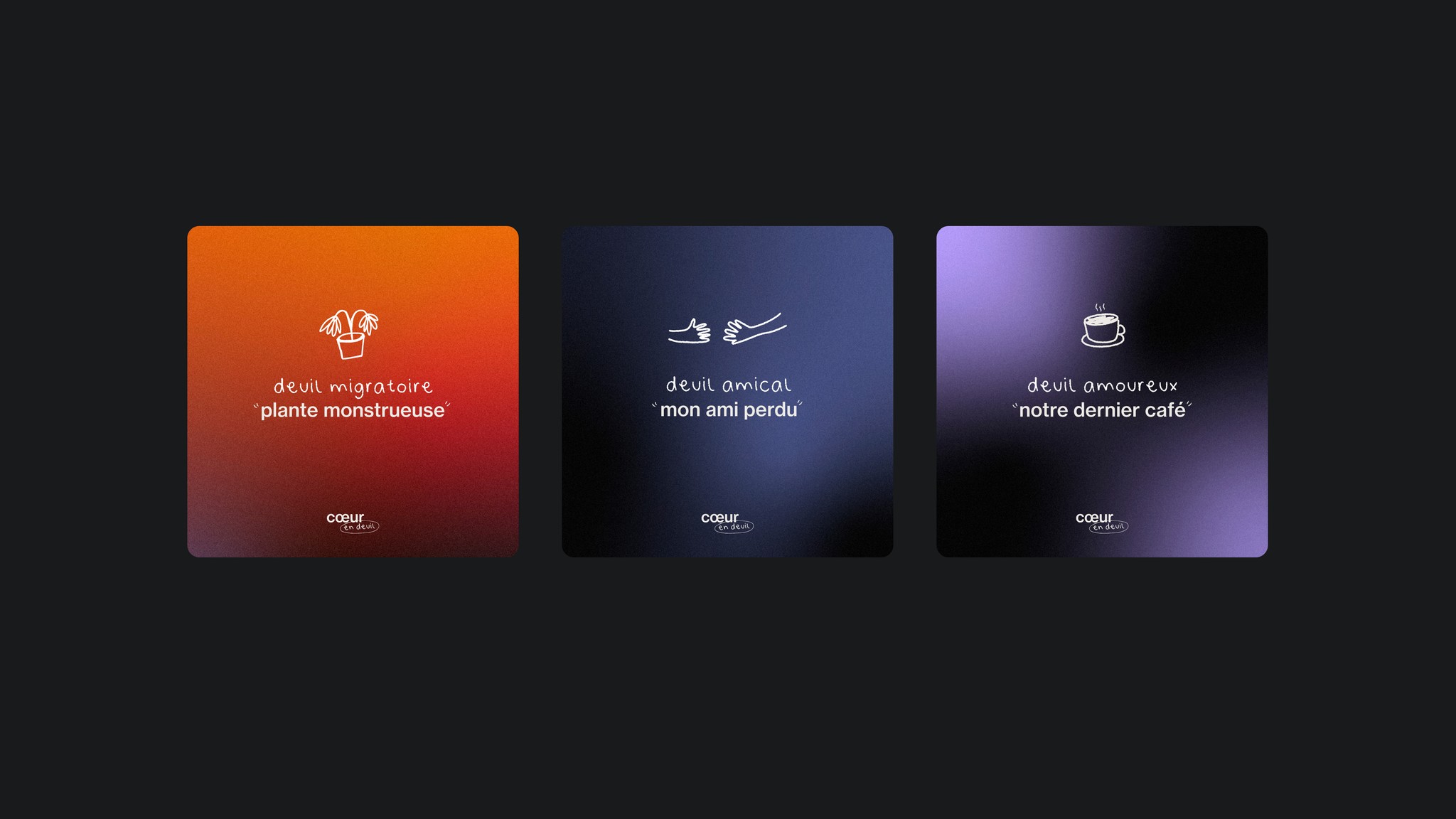
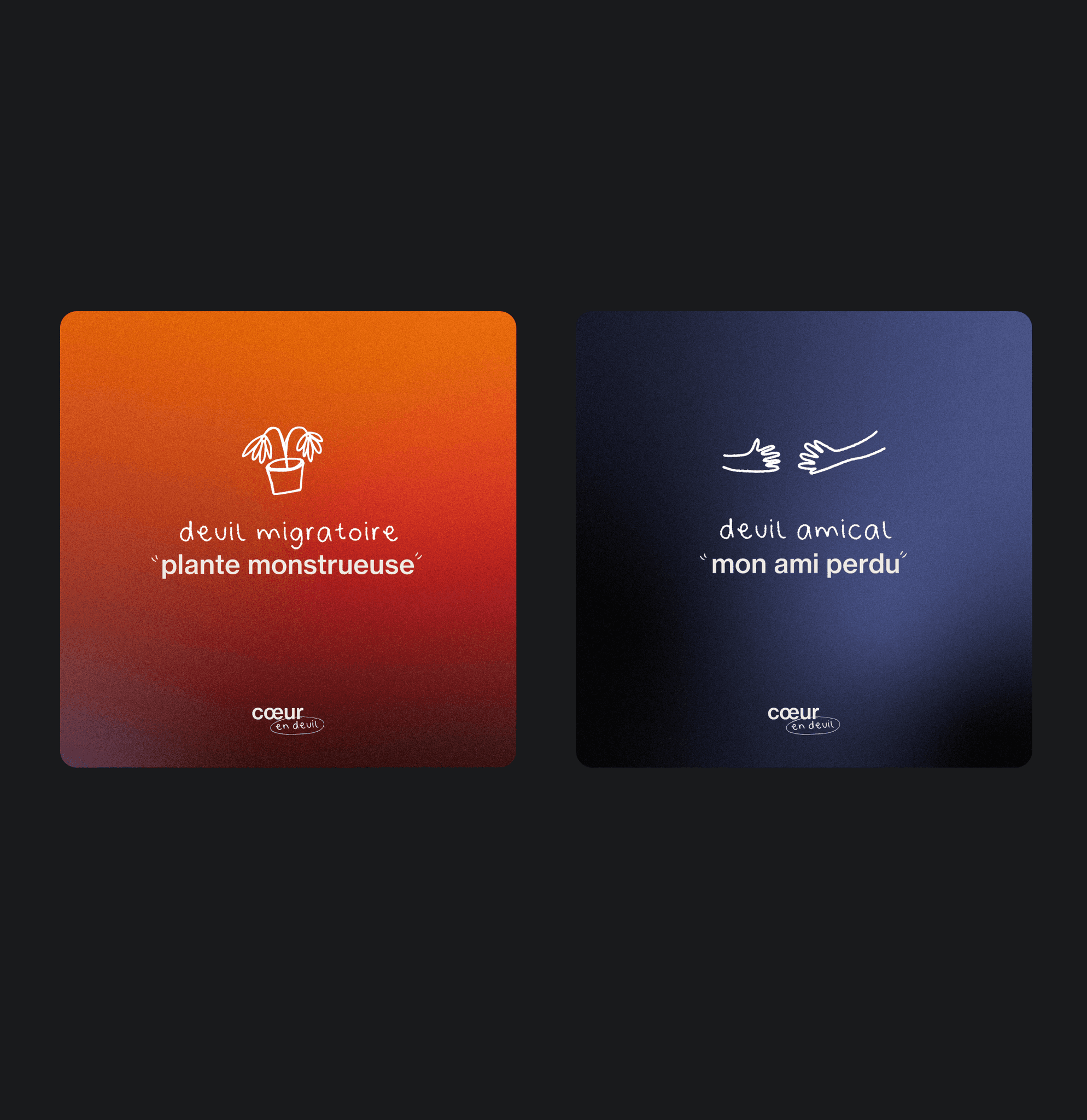
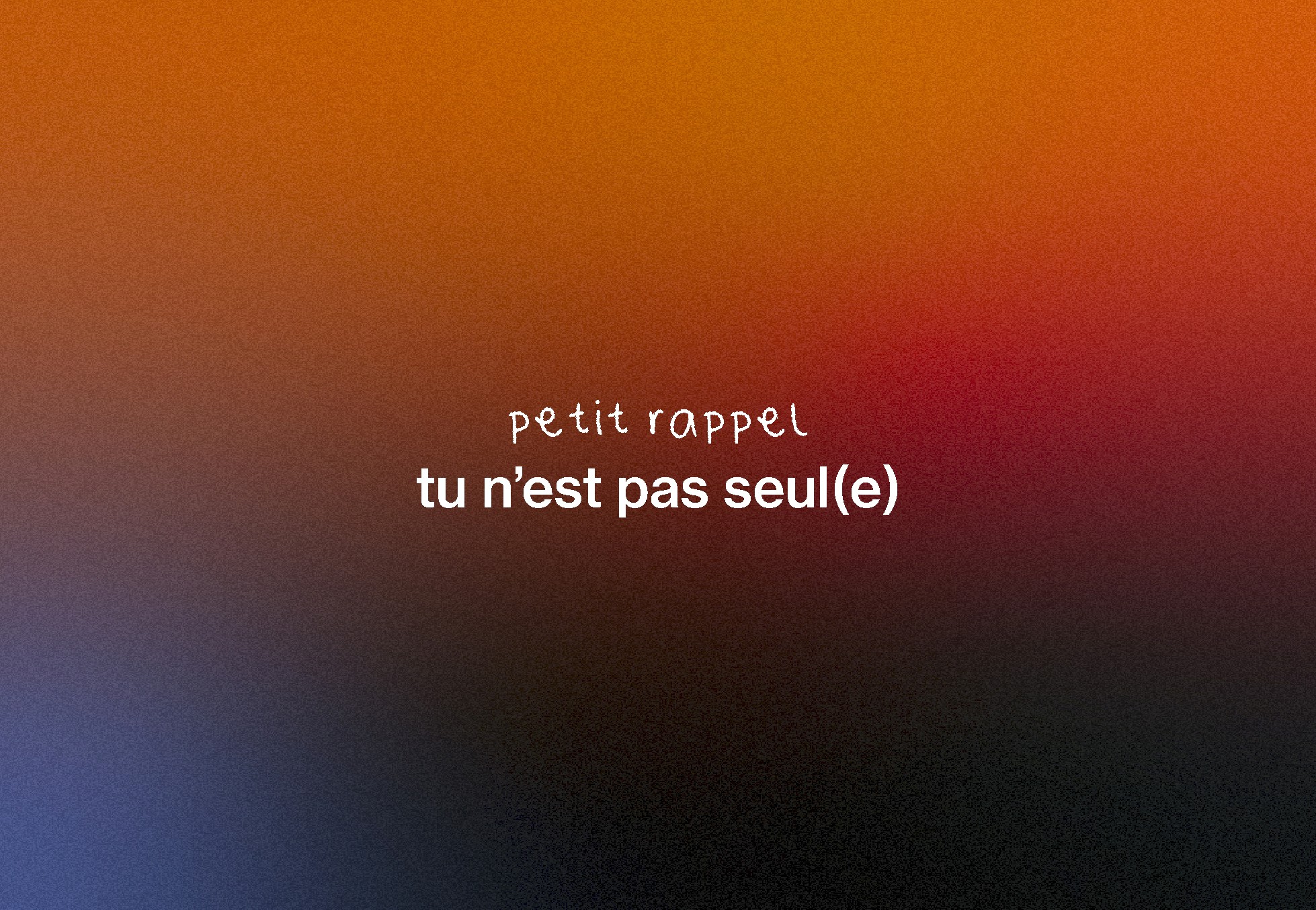
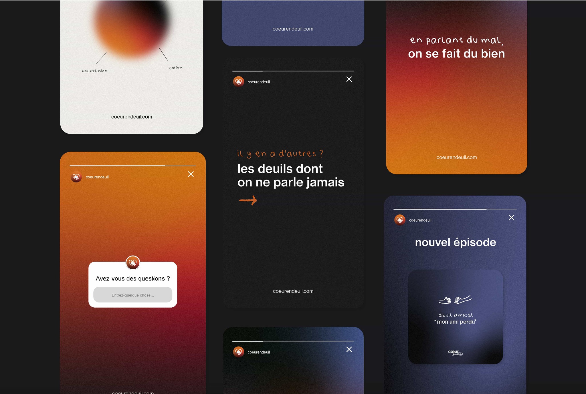
The colors chosen for this podcast reflect the different emotions that arise when going through a loss. The deep black evokes denial and sadness, while warmer hues, like orange, symbolize hope and the moments of light that persist despite the pain. I worked with gradients to illustrate the fluctuating nature of these feelings.
These subtle transitions between colors show that emotions intertwine: one can feel multiple states at once, or pass from one to another over the days. The gradient conveys this fluidity, capturing the idea that grief is a nonlinear process, where everything constantly mixes.
Colors
The colors chosen for this podcast reflect the different emotions that arise when going through a loss. The deep black evokes denial and sadness, while warmer hues, like orange, symbolize hope and the moments of light that persist despite the pain. I worked with gradients to illustrate the fluctuating nature of these feelings.
These subtle transitions between colors show that emotions intertwine: one can feel multiple states at once, or pass from one to another over the days. The gradient conveys this fluidity, capturing the idea that grief is a nonlinear process, where everything constantly mixes.
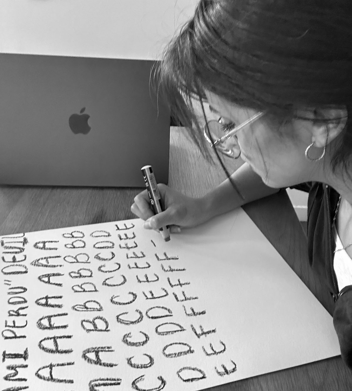
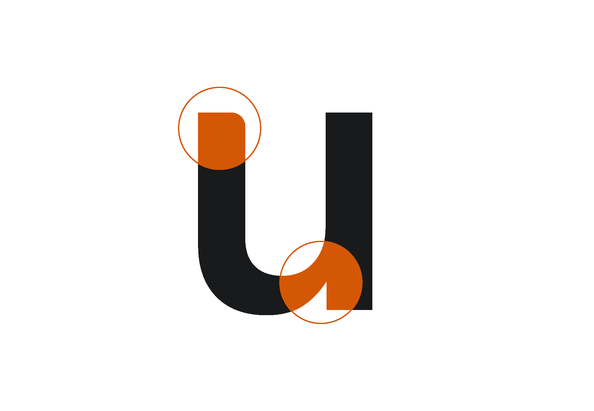
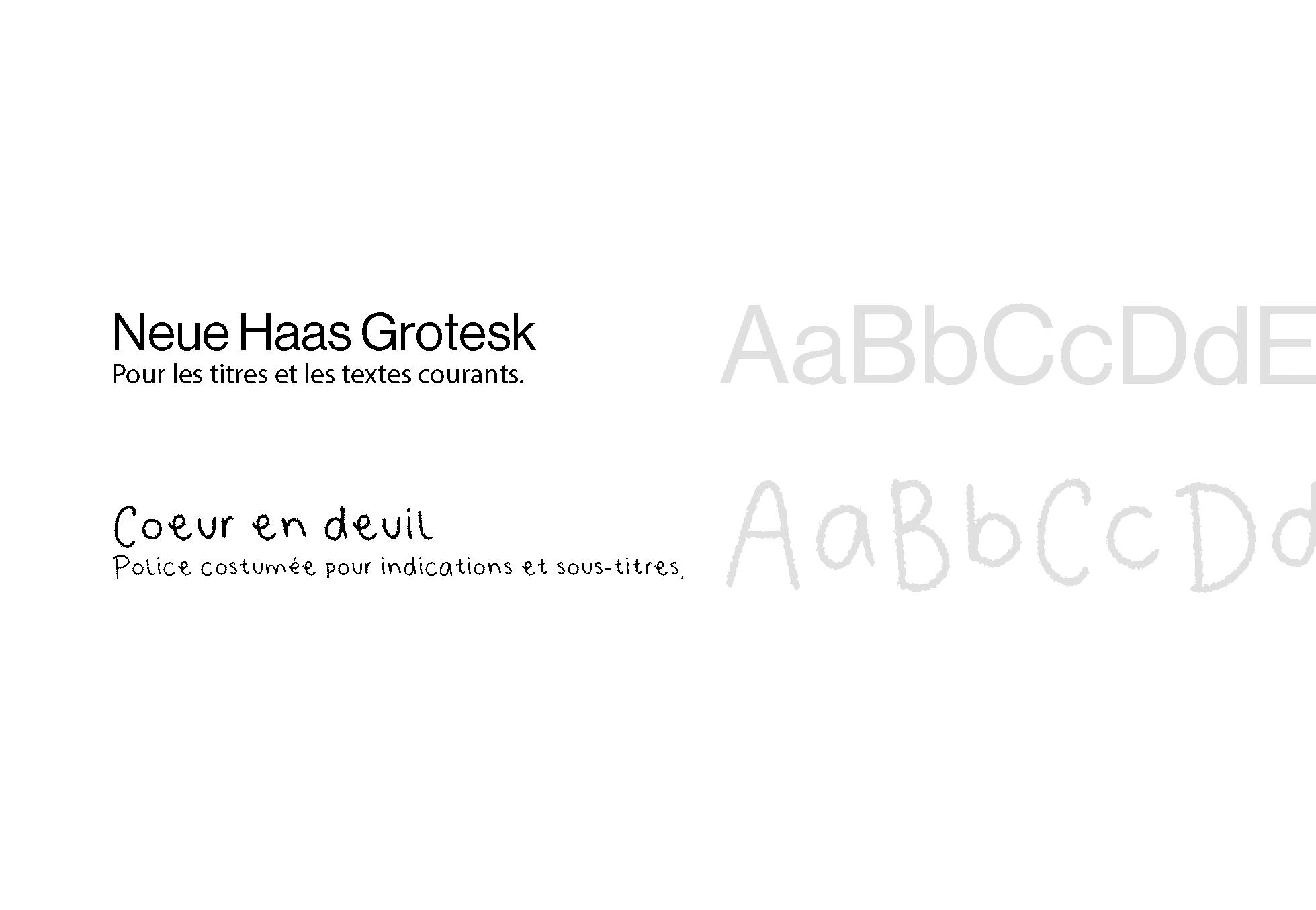
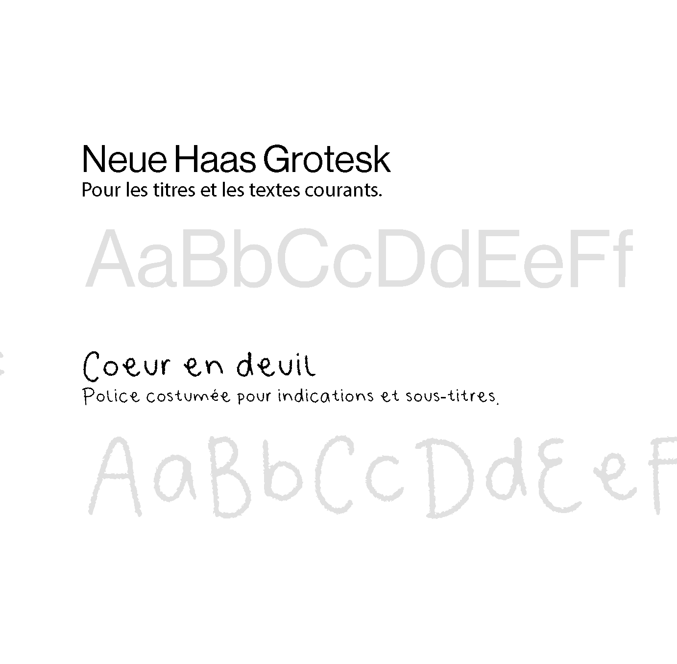
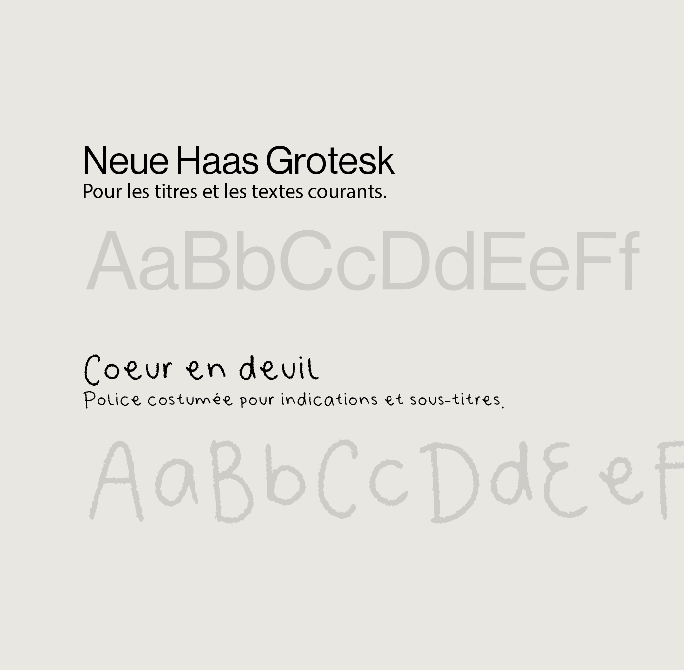
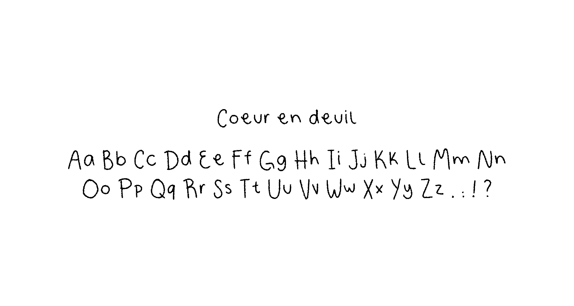
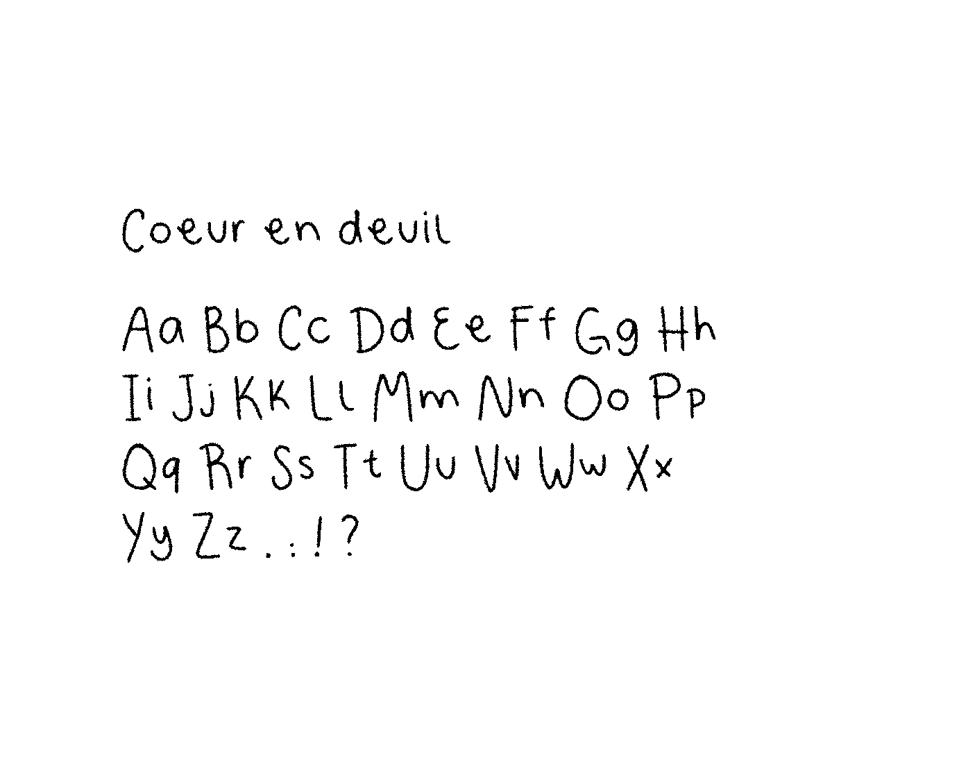
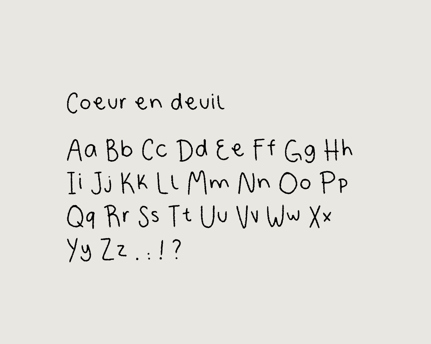
Typefaces
Typefaces
For the visual identity of this podcast, I chose to combine two complementary typefaces. The Neue Haas Grotesk, a sober and timeless sans-serif, brings structure and readability, providing a clear framework to explore a topic as intimate as grief.
In contrast, I created a completely handwritten typeface to illustrate the human, imperfect, and deeply personal dimension of this experience. This handmade work reflects the authenticity and vulnerability of the grieving process, while highlighting the idea that each journey is unique.
For the visual identity of this podcast, I chose to combine two complementary typefaces. The Neue Haas Grotesk, a sober and timeless sans-serif, provides structure and readability, offering a clear framework to explore a topic as intimate as grief.
In contrast, I created a completely hand-drawn typeface to illustrate the human, imperfect, and deeply personal dimension of this experience. This manual work reflects the authenticity and vulnerability of the grieving process, while highlighting the idea that each journey is unique.
For the visual identity of this podcast, I chose to combine two complementary typefaces. The Neue Haas Grotesk, a sober and timeless sans-serif, brings structure and readability, providing a clear framework for exploring a subject as intimate as mourning.
In contrast, I created a completely handmade typeface to illustrate the human, imperfect, and deeply personal dimension of this experience. This manual work reflects the authenticity and vulnerability of the mourning process, while highlighting the idea that each journey is unique.


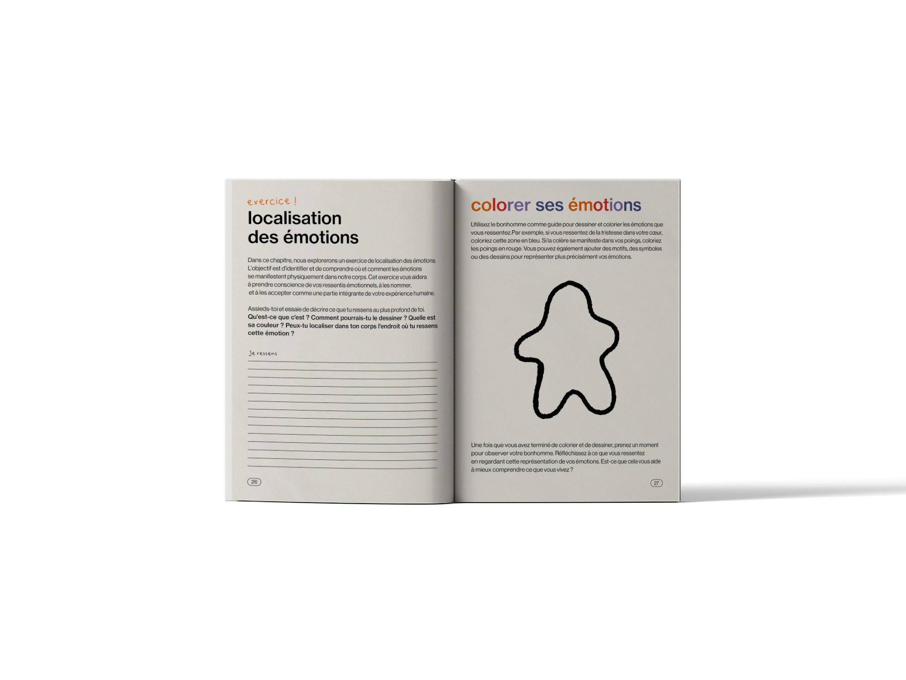
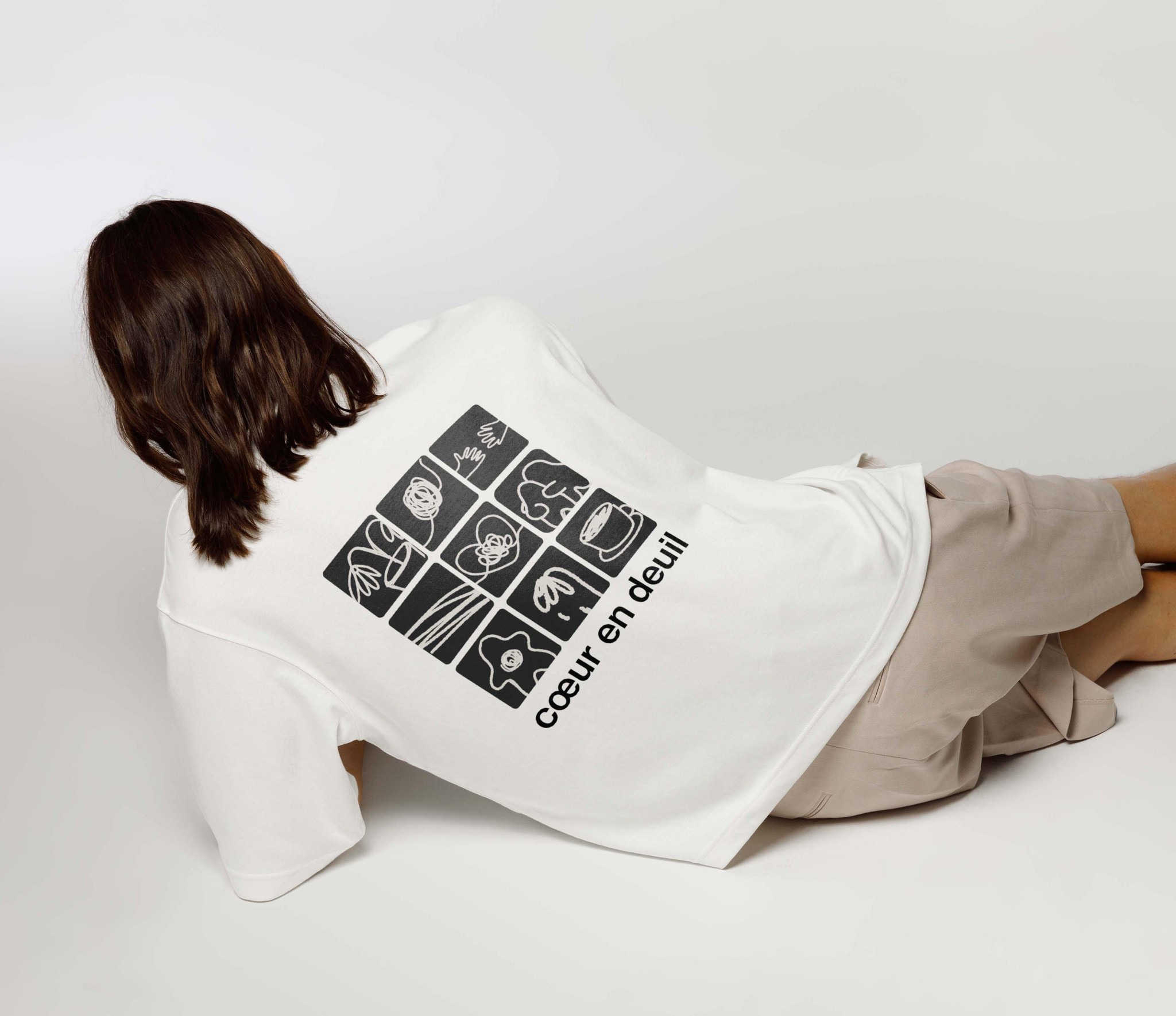
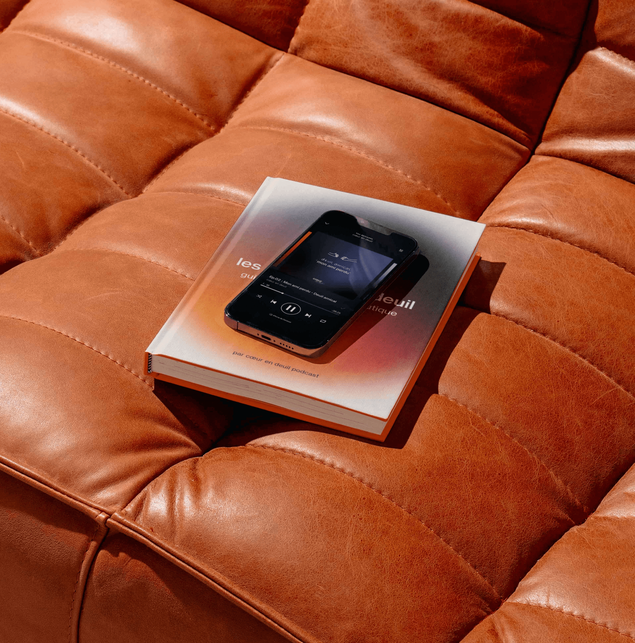
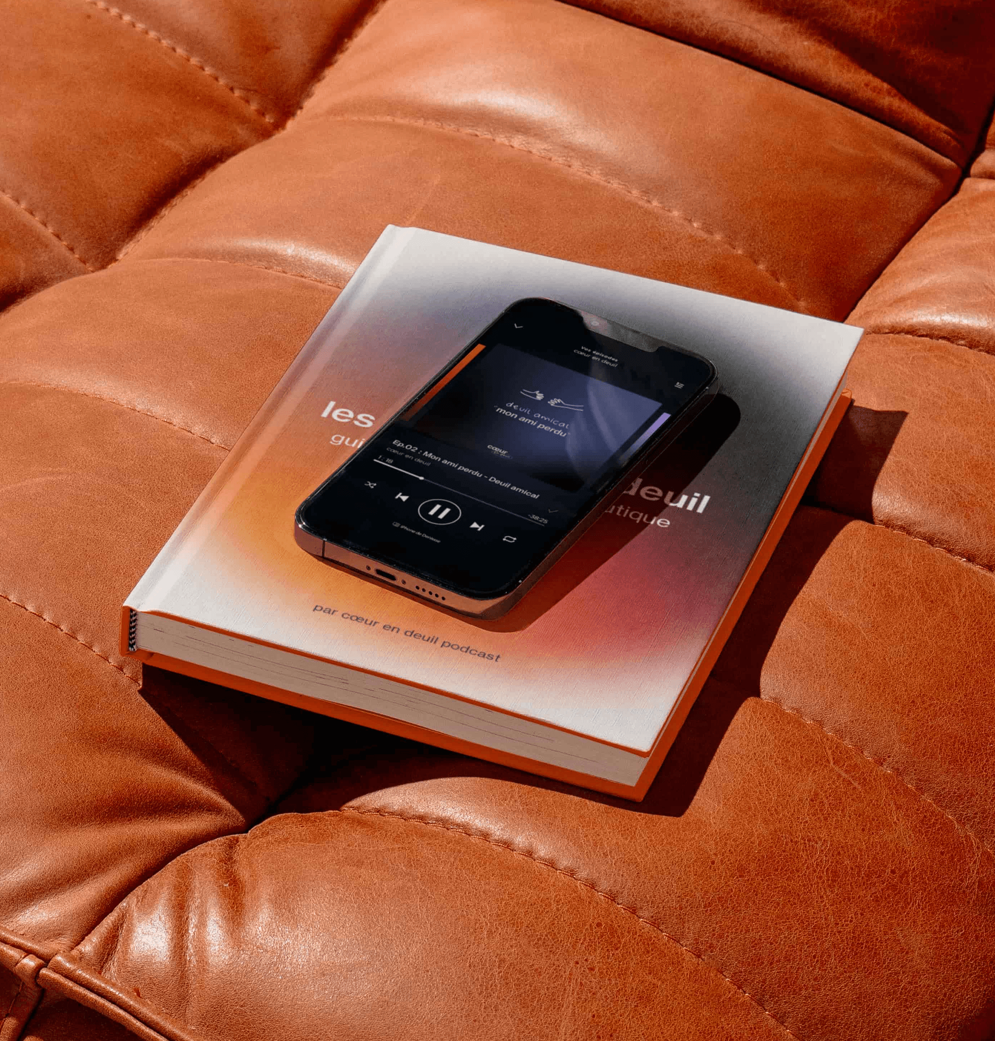
Shop
Although it is essential to turn to professionals, such as psychologists, for in-depth support, the podcast also offers a shop designed as a complementary resource.
This aims to provide comforting tools and elements to help people better understand their emotions, cultivate a positive attitude, and remember that they are never alone in their journey.